Five: Paul Williams
This image from Paul Williams is a fashion photograph. The photographer uses a fairly dark colour background and places the model on the right hand side of the image. The lighting used in this photograph is lighting up the model herself, rather than the background, therefore making the model the main focus. the composition of this image allows the model to be seen from the head to the waist. The angle of this image has been taken from directly in front of the model.
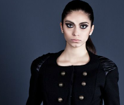
 This photograph is my own to represent fashion. The composition allows the model to be shown from head to waist. The background is a fairly dark grey. the lighting is fairly natural but darker on one side to create soft shadows on the face. This photograph has been taken from directly in front of the image. The facial expression of the model is very blunt and serious, allowing the audience to create their own thoughts and feelings of the model.
Overall these two images connect to one another because they are both showing fashion photography. They both have similar compositions, showing the models from head to waist. The lighting is very similar and have both used a dark background. The models facial expressions are also very much the same.
Four:
This image is of the Tower Bridge. The angle of this photograph has been taken from the right hand side of the bridge. The lighting is fairly dark due to the image being taken in the evening. the colours ate very bright & blue in this image due to the lighting on the bridge itself. A limited amount of the background has been included in this image to make the bridge the main object in the photograph.
 This image is my own photograph that I have taken during my 5 hour exam to tell the story of London tourist attractions. I have made my photograph black and white to make the image look old fashioned. The lighting I used was natural day light due to it being taken on a location shoot. Within the composition of the photograph I have included the boat in my photo as I felt it made the photo more real life and makes the photo different to others as they only focus on the bridge. The angle of this photo has been taken from the left hand side of the bridge.
Overall these images connect to one another because they are both of the Tower Bridge. They both represent London tourist attractions. Also the angle of the photographs have both been taken from one side of the bridge, rather than directly in front of the bridge.
Three: Hannah Wellbourn
This image represent the red shoes within the film 'Wizard of Oz'. The image is made black and white but it has used selective colour by still keeping the shoes red and everything else black and white. This shows a contract between the two colours. The lighting in this image seem to be very natural and focuses on the shoes themselves as they are the main object/focus of the image. The composition this photo allows you to see more of the right hand side background. The photo has been taken from a direct in front angle.

This image is my own photograph that I have taken in my location 'Dorothy' shoot. During the editing process I made the image black and white and then edited the shows to make them red, like the shoes in the film. After this I then blurred the background as I felt it looked better and made you focus on the shoes rather than the background when looking at the image. The lighting I used for this photo was natural light because I took it on a location shoot and had to rely on the natural sun light. The angle I took this photo from was slightly above the shoes to make them the main focus.
overall these images connect to one another because the main focus of both images is the bed shoes. They are also both black and white images but keeping the colour of the shoes. Both images have been taken in relation to dorothy in the film 'Wizard of Oz'.
Two: Ray Spence
This photograph shows the damage of anorexia and expresses the models feelings. the image is in black and white and you can see from the angle the photo has been taken that her reflection is in both mirrors, left & right. Due to the way the model is hanging onto the pole it creates the feeling that she is clinging onto her life. The model looks very boney, stressed, lonely and weak.

This image represent the illness of anorexia and brings about awareness. This image is my own photograph that I have taken to show anorexia. I have used a tape measure in my photograph to represent that the model has replaced food, showing that the constant worry of weight have taken over her eating. I have used a black background to create a dark, lonely atmosphere. The lighting I used was a overhead light to focus on the model herself rather than the background.
Overall both these images connect with one another because they both show anorexia through the images themselves. They also connect because both images represent something, for example: the first image shows the model hanging on to a pole, representing she is clinging onto her life & the second image shows the model holding a tape measure over her mouth, representing that she has replaced food with the worry of her weight.
Photographer Five: Sue Kennedy
Why chosen: I have chosen this photographer because the photographer has captured interesting pictures/portraits of babies. I like the simple grey background used in most of her images to keep the attention on the babies themselves. I also like the way the babies don't look posed, they look natural.
In this image the photographer has used a light grey background with natural lighting. The photographer has captured the baby laughing which makes the image interesting to look at. The baby is the main focus of the photograph, therefore a simple, plain colour has been used for the background so that it doesn't take away the attention from the baby.
This photograph is very similar to the picture above, a grey background has been used and natural lighting. The baby is also the main focus of this image. I like the position of the baby in this photograph and the angle it has been taken from. The colour has been reduced from this picture making it grey and white rather than black and white, this makes the babies big brown eyes stand out in the picture.
This picture also uses the grey background, as many of her images do. The lighting is also very natural in this image. This image looks less posed then the image above because the baby is just naturally sitting on a chair. The babies hat and eyes are the same colour which draws the eye when looking at the photograph.
This photograph shows the relationship between a mother and baby. The baby is very naturally posed, placed in her mothers arms. The lighting in this photograph is quite dark and focused on the baby itself. The image has been make black and white so that the baby is the main focus because the mothers top is black, therefore you can not really see it. The background is also black, meaning the mothers top will blend in with the background.
Influence: This photographer has influenced me slightly as I would be interested in taking photographs of babies as I feel they are different to previous photographs I have taken of models.
Summary: Overall this photographer hasn't really influenced me as I was unable to take photographs of babies, therefore this photographer has no link to my own work.
Photographer Four: Ben Moore
Why chosen: I have chosen this photographer because I am very interested in portrait photography to express emotions. I feel these images themselves tell a story of thought and feelings just through the models facial expressions. I also like this photographers work because they are close up portraits, which I like. This photographers work is simple but very interesting and clearly shows a story.
This photograph creates the feeling that the model is thinking, feeling stressed. The lighting is very natural and lights up one side of the models face more than the other. the models face is the main focus of the image and hardly no background is included in the image.
This image is in black and white, helping create a atmosphere of loneliness, as from the models facial expression he comes across to be very alone as it looks like from the image that he is looking outside a window. The lighting looks very dark in this photograph but there is a light coming from the right hand side (maybe from the window). The model is looking down which instantly makes the audience assume the model is feeling down.
This image clearly shows the emotion of sadness due to the model looking down with her eyes closed. The lighting in this photo is directed onto the models face, the face is the main focus of the picture, there is no background involved apart from the clothes the model is wearing. This photograph could show many different emotions but from simply looking at the image you can see that the model is upset about a situation.
This image is the same model as the picture above, however this picture isn't a close up and reveals the story behind the picture above. The reason for the above picture to show the emotion of sadness is because she is a homeless women. The lighting in this picture is natural day light as you can tell due to the location being outside.
Influence: This photographer has influenced me to tell the story of different emotions because I strongly feel that a single photo of a model showing a emotion tells its own story. I have also been influence by the idea of homelessness and poverty from the two images above of the homeless lady.
Summary: This photographer has influence me as I took my own photographs of poor and rich situations, in relation to this photographer showing poverty.
Photographer Three: Abelardo Morell
Why chosen: I have chosen this photographer because I was very intrigued when looking at their work. I believe it is a very creative idea and I hadn't come across photographs like this before, therefore I found this photographers work very interesting. The use of the cardboard cut outs makes the images very unique compared to photographers with actual human models. The photographs being in black and white make the images look like they have come from a old book or newspaper.
This image re creates a scene from Alice in Wonderland when they are at the tea party. The cut out characters look small compared to the objects in the image, just like the film itself. The images being in black and white create a spooky atmosphere because the lighting seems to be darker. The detail of the cut out characters in this image helps tell the story of Alice in Wonderland and makes the photos a lot more interesting to look at.
This photograph is also in black and white, showing a different scene from Alice in Wonderland. This photograph looks like it has been taken in a forest due to the background looking like a tree, therefore this creates the feeling of there being a little unknown world, just like Alice discovers in the film.
 This image shows a book and a cut out character, the character comes across to be very small compared to the book itself. This image is also black and white like a number of images from Abelardo Morell work. Due to the image being black and white the lighting seems to be very dark. The photo has been taken from slightly above the objects to make the character seem smaller.

This photograph shows the scene from Alice in Wonderland when she discovers the key and drink that makes her smaller. The picture shows the cut out character of Alice to be big and then small once she has drunk the drink. This image is also black and white, there is limited background included in this photograph because the characters are the main focus.
Influence: I like this photographers work, however it hasn't really influence my work in any way, as I feel it would be hard to re create this type of photography in my own way, therefore I would have to copy it and i wouldn't want to do that.
Summary: This photographers hasn't influence my work in any way apart from the story line of Alice in Wonderland.


.jpg)


